Adorning your graph
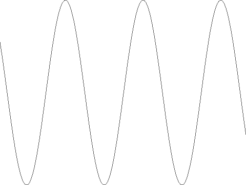
In the first page of the tutorial, we created a very basic graph:

Compared with vanilla Matplotlib, the result was very sparse: the data are plotted, but there are no labeled axes or anything. The reason for this is QPlot’s design philosophy: you, the user, know what you want your graph to look like; automatic defaults are almost certain to be wrong.
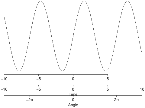
Fortunately, adding axes is quite easy. Here are a few suggestions for adding x-axes:
qp.xaxis(ticks=np.arange(-10, 10, 5), y=-1.1)
qp.xaxis('Time', lim=[-10, 10], y=-1.4)
qp.xaxis('Angle', ticks=[-2*np.pi, 0, 2*np.pi], labels=['-2π', '0', '2π'], lim=[-10, 10], y=-1.7)

As you can tell, you need to specify not just what you want your axis to look like, but also where you would like it to appear: You can specify the range the axis should space (range=[-10, 10]), where to place ticks (ticks=np.arange(-10,10,5)), what to print by those ticks (labels=['-2π', '0', '2π']), what to name the axis (title='Time'), and at what y-coordinate to draw the axis y=-1.1. Any or all of these elements may be specified or omitted as required.
By the way, does your text look cut off? Type qp.shrink() to invoke QPlot’s shrink-to-fit algorithm.
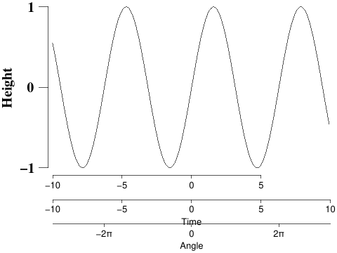
Naturally, there is an equivalent qyaxis command. And the appearance of the axis may be further customized. For instance:
qp.font('Times', 15, bold=True)
qp.axshift(5)
qp.ticklen(10)
qp.textdist(5)
qp.yaxis('Height', ticks=[-1,0,1], x=-10)

(font specifies font properties; axshift causes the y-axis to be rendered some number of points to the left of the location specified; ticklen specifies how long the axis ticks are (in points); and textdist specifies how far from the ticks the text should be rendered. Note that all of these customizations are specified before the plot command (qyaxis(...)) that they modify. (Unlike in Octave or Matlab, where the set command is applied after the graphical element to be modified has been created.)
Having learned how to label our axes, let’s return to plotting of data on the next page.